We currently live in a brave new world of HTML5, AJAX and dynamic scripting. Most browsers, including those on low powered phones are able to render complex web page layouts and handle asynchronous requests and client side post-processing. But what if you were stuck on an old machine with nothing but a Lynx?
Few months ago, one of my readers emailed me complaining about my comment spam countermeasures which do a little bit of Javascript magic behind the scenes to foil the dastardly plans of the robot kin. Unfortunately it was also preventing said reader from posting comments. This person was browsing the web on a “backup” computer chiseled out of stone some time in late Pleistocene, which was not powerful enough to run such frivolously luxurious things like the X server. Hence, the only way to browse the web on that thing was to use a command line text browser. There are quite a few of them out there, and most do not support Javascript. Hence the predicament.
This got me thinking: I’m a geek who enjoys living on the command line as much as the next guy, and yet my own site is a bit of a nightmare to use with a text browser. I wonder what other sites are like. How would I feel if I was that reader. What if I didn’t even have access to fancy browsers like elinks that have some rudimentary Javascript support. What if all I had was Lynx? I decided to find out.
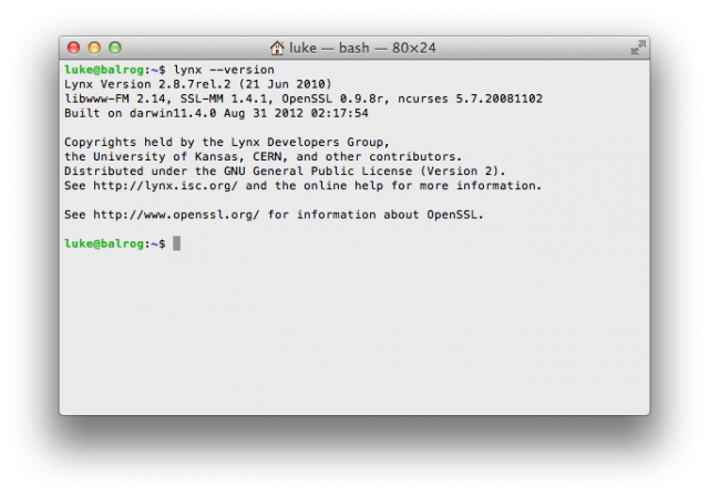
Initially I wanted to dig out an ancient laptop, fit it out with a bare bones Debian and actually replicate the experience of my technologically impaired comrade. But since I am currently out of shitty laptops in working condition I decided to use my good one and just make believe. For experiment I decided to use Lynx 2.8.7rel.2 which I installed via Homewbrew:
Why Lynx? Because it is simultaneously the most popular, most common, most feature impaired and most clunky of the available options. If you are using Lynx, then chances are that something is terribly wrong, and you are probably shit out of luck anyway. So how would popular websites look in such an environment? Let’s find out.
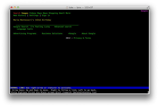
The first site I went to was of course Google, and quite unsurprisingly it looked quite presentable. In fact, I believe that Google front page looks much better in Lynx than it does in Internet Explorer 6:
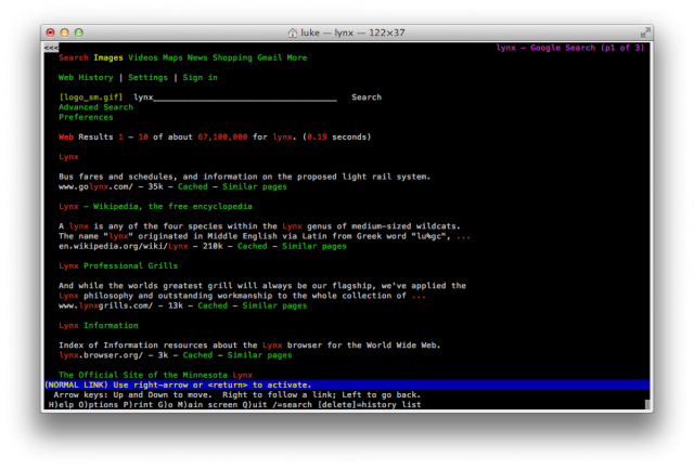
A simple search looks equally good. The layout is simple, well spaced out and quite readable. Google’s minimalistic design philosophy pays off big time allowing the designers to create layouts that look quite fetching even on a very basic, bare bones browser:
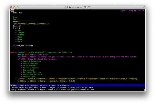
All the information you need is there. The text blocks are neatly defined and nicely spaced out but compact enough to show you several results per page. There are no unnecessary links, garbage or superfluous images. The search page gracefully degrades but remains usable. Unfortunately, the same cannot be said about Goggles’ wannabe competitor, Bing. Their front page is actually ok – a little bit off-center if anything, but still readable and usable:
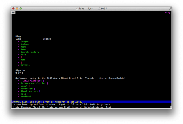
The results page however makes it painfully obvious that no one has ever tested this layout in a text only browser:
The results are so messy not even a single idem fits on my screen, the link placement is horrible, and the use of improperly tagged images makes the entire thing look ugly. You can still kinda use it, but it is nowhere near as convenient and easy to look at as Google.
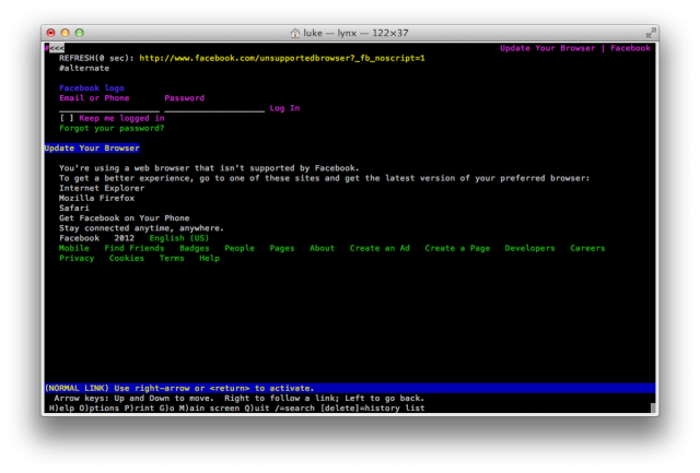
Facebook exhibits a similar level of fail:
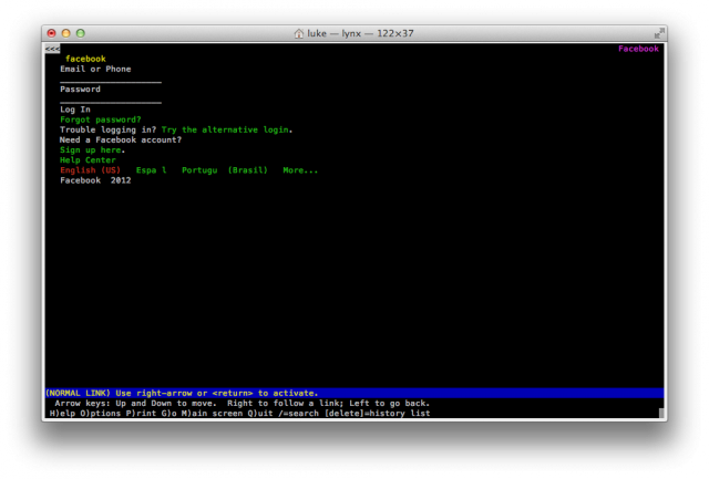
They blatantly tell you, “your browser sucks, GTFO”. I can get away with that sort of thing, because I am an arrogant, elitist asshole. Facebook on the other hand is a big company which is in the business of herding human souls and selling them for profit. Granted, they have a captive audience so I guess this is not surprising. In fact, they don’t seem to be concerned at all that Lynx can’t navigate their login procedure. There is some sort of redirect logic in there that breaks the session in Lynx and so the site is completely unusable. Unless you navigate to the mobile version:
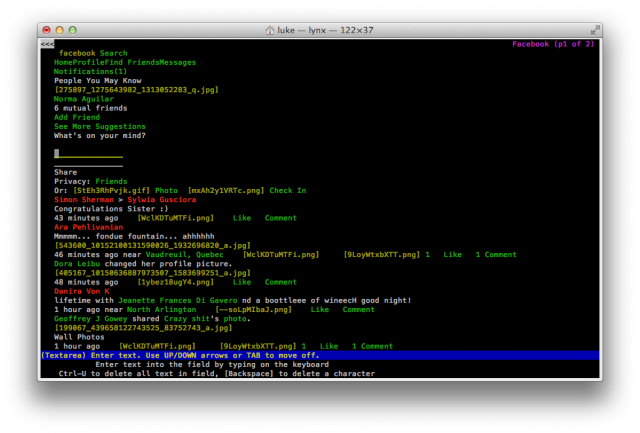
They apparently don’t care about Lynx users, but do care about the users with shitty blackberries and low end phones without decent web browsers. This version of the page looks and feels much better. Your stream does not look anywhere near as good as the Google search results above:
The boundaries between the stories are poorly defined, and the reliance on images hurts the experience a lot. That said, Facebook is a very image driven site so this is not terribly surprising.
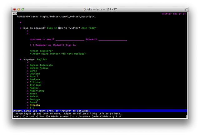
Twitter is in a very similar situation. Their main page sucks:
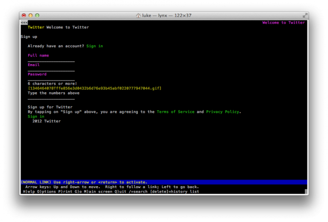
Though at least they don’t condescendingly give you shit about using a crappy browser. That’s something positive I guess. Their mobile login page is better:
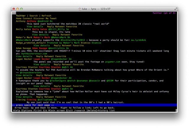
The actual stream is kinda messy, but overall a bit better than that of Facebook. Mostly due to a smaller number of embedded images rather than to actual formatting effort:
What lesson did we learn here? If you are browsing with Lynx, mobile sites offer superior experience. And if you are a web designer and you know your main theme will look like ass in Lynx it could potentially be a good idea to serve up your mobile site to your text browser users. Granted, new fangled, heavily visual social media sites are bound to have layouts that do not cater to old school browsing methods. So lets see how meccas of nerdism and geekery fare in this department.
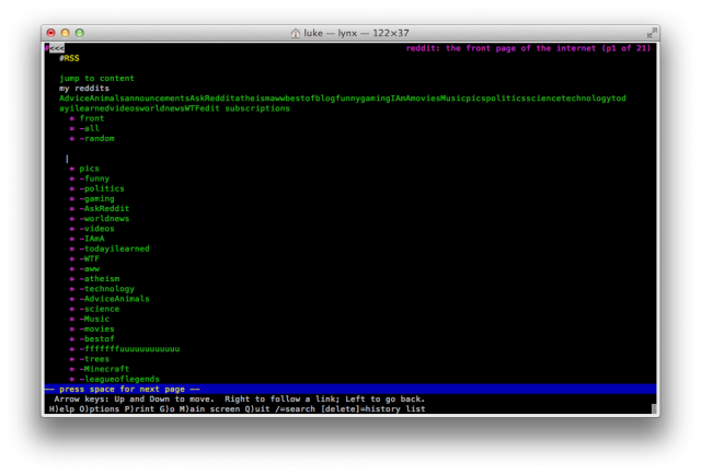
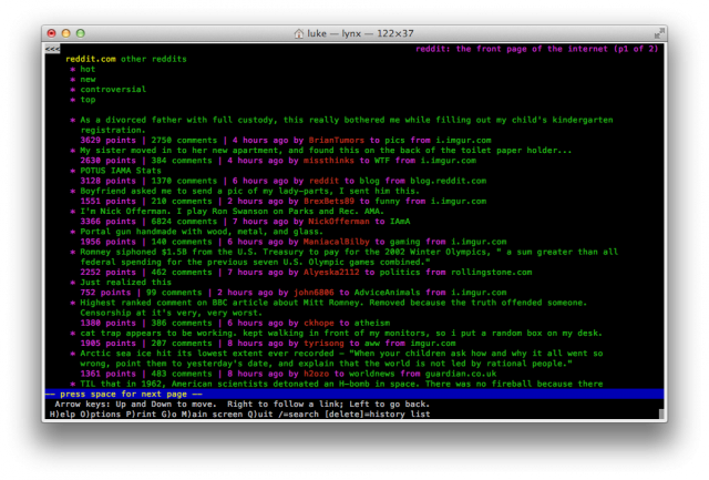
The front page of Reddit looks like shit:
The top of the page menus take over the entire layout, and when you open it in lynx you have to actually scroll quite a bit down to see the actual content. This is a common layout issue on a lot of sites which put their navigation above content. Consider this a usability tip – with CSS you can place your nav bars on the bottom of the HTML document, but still have them rendered above the content. Folks with regular browsers won’t even know something is up, and those browsing on mobile devices, text browsers or screen readers won’t have to scroll five miles down to get to the content.
You would think that a site with such bare-bones, minimalistic layout would look fine in a text browser. And yet, it looks like shit. Funny thing is that Reddit designers know this, and their mobile layout actually doesn’t look that bad:
It could use some better spacing, but the content is there and the site can be read and navigated with minimum hassle.
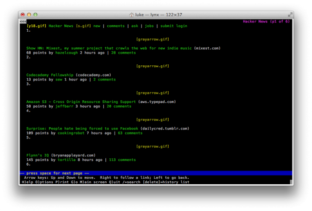
Hacker News – another hub of concentrated technological know-how is an example how to do this right. They don’t even have a mobile site, because their layout just works:
I would give them A+ for layout and navigation, if it wasn’t for the fact they forgot to provide alt text on the grayarrow.gif image. Because I frequent the site in a regular browser, I know that this image is the “upvote” arrow which is kinda like the Facebook’s like button, but without all the fail. Unfortunately, if I visited Hacker News for the first time in Lynx I would have no clue what is this gray arrow about, and why is it treated as a link.
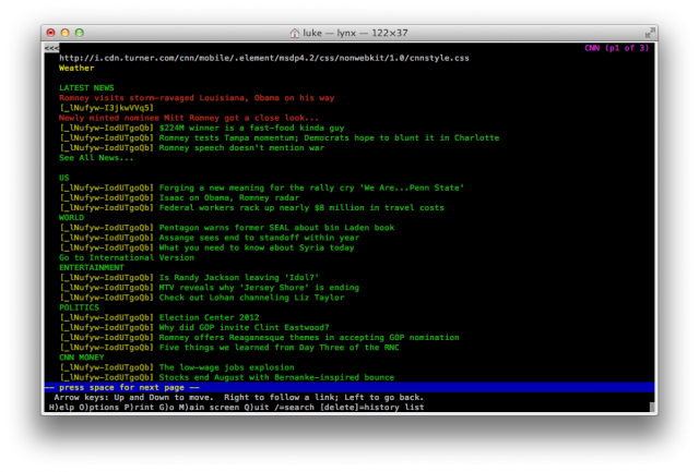
The lack of alt text on images is actually a very, very common issue. CNN for example makes the same exact mistake on their mobile site:
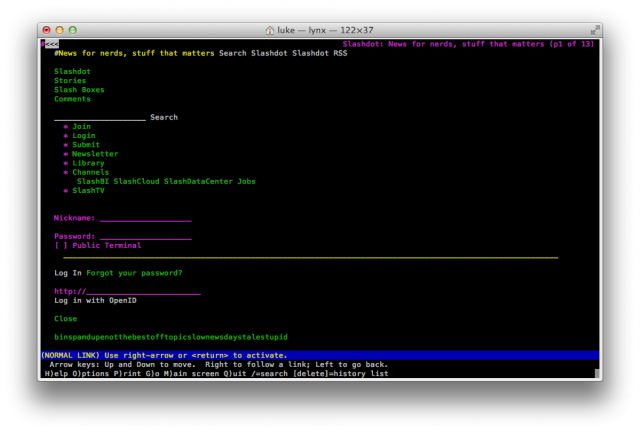
Their site looks great, but the weird gibberish to the left of each story is incomprehensible. If you visit their site in a different browser you will realize it is simply a graphical bullet point. Skipping alt text is the difference between incomprehensibility and complete readability. I won’t show you the regular front page of CNN because it looks strikingly similar to reddit. Or slashdot for that matter:
You young whippersnappers probably don’t even remember Slashdot anymore. Long before Digg and Reddit it was the place to be. It was where a young, impressionable college student would go to talk about Unix, hate Bill Gates and learn to be an elitist asshole. They also used to put Futurama quotes in their HTTP headers. But alas, their site looks like shit in Lynx.
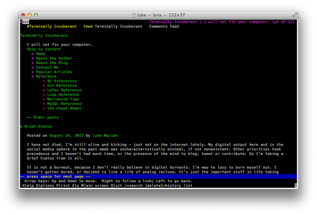
How does Terminally Incoherent compare to all of the above? Well, except the comment thing I think I’m doing ok:
My top of the page menu is a bit on the large side. I could probably loose the sub-menu under references, since that stuff is accessible from elsewhere anyway. Other than that though, I’d say my page is pretty readable in the text browser.
So what did we learn from all of this? There are a few things you can do to improve your readability, accessibility and usability:
- Putting navigation bars under the content really helps. If you load your navigation code up top, visitors using text browsers, shitty phones and screen readers will see about 3 pages of menus before they get to actual content.
- Alt tags on images are incredibly important but almost universally ignored. Even CNN got this wrong, and as a result their otherwise very nicely laid out page had incomprehensible gibberish all over the place.
- If you can’t be bothered to design a usable page layout, but you do have a working mobile site, take the five minutes to HTTP redirect text browsers and screen readers that way.
What is the point of this exercise? I know someone will come here and tell me no one (except that one reader of mine obviously) uses Lynx anymore. That there is absolutely no point in supporting them. But that would be incorrect. You see, browsing the web in Lynx is a lot like using a screen reader – you know, one of those tools that helps the vision impaired users partake in the wonderful world of the interweb. These applications “see” about as much of the web as Lynx does. The lack of alt tags on images and top-loaded nav bars are constant sources of frustration for blind internauts. So this whole adventure was an excercise in fretting out usability problems in the way that is relateable to you – regular users.
I could talk about alt tags ad usability until I was blue in the face and most people would not care. But here is an example that hopefully makes this painfully obvious. The internet has huge accessibility problems. Even huge, reputable sites have a lackluster approach to it. Why is the mobile version of cnn.com littered with semi-random character strings like _lNufyw-I3jkwVVq5? Because someone in their web design department thought that a styled li element was too quaint, but at the same time was to lazy to type in something like alt=”*” in their code. I’m actually more disappointed that Hacker News made the same exact mistake – I thought they would know better.
Have you ever been trapped on a machine with only a text browser? What were some of the best and some of the worst websites you visited in text-only mode?


I guess Lynx users don’t frequent sites like Facebook and Twitter to a great degree. As a Lynx user on a pure command line laptop I tend to frequent sites that have good info and navigational layout.
Results vary depending on the text mode web browser used too, try w3m and links to and see how sites render.
Nice article btw :)
In emacs, I use emacs-w3m through pylookup addon, so Alt+Enter on any function gives a page from actual online html docs (ok, I’ve cached them locally now, for performance reasons, but I was browsing python.org at first).
So that’s an actual text browser accessing the internet not-just-for-lulz in the second decade of 21st century, though it’s probably not what most people use web browsers for.
I love lynx very much. my server machine is LFS without X, so when I’m doing something directly on the server I always use lynx or wget. lynx -dump or lynx -source are quite handy. Before I start writing a perl script with some HTML-module for parsing I simply use lynx -dump | grep (or awk or perl) to have a look at the HTML text without tags.
And all you SEO types out there: remember that GoogleBot does understand neither javascript nor flash or other crap, only pure HTML. So if you want to be found and cleanly indexed by all means make the page readable with lynx and you have success with Google automatically.
Re: HN, instead of using alt text, they should just use the proper unicode character of the “black up-pointing triangle”, which Lynx can actually show perfectly well, and it scales better too.
@ ths:
That’s not quite so true anymore: https://twitter.com/mattcutts/status/131425949597179904
Personally, while I made sure my personal landing page looked good on it (and it wasn’t hard, since it’s extremely simple and JS-free), I don’t remember the last time I used it. I usually just use SSH port fowarding and point Firefox to the local port.
Hello from consoleland! I am pretty surprised to see that this article is inspired by me. I’d just like to make few corrections:
1. I am using links2, not lynx.
2. I don’t use it in text mode but rather in framebuffer 1280×1024 graphics mode.
3. It is my main, not backup, machine and it isn’t that old. It is from 2000 and has 700MHz Pentium III and 64MB of RAM.
4. It can run X server but all the software that was usable under x11 works faster on framebuffer.
Also if you are wondering how I am commenting on this I compiled older version of links (2.1pre21) with javascript enabled and small patch to prevent your server from sending it gziped html. I works pretty well.
Also if you want to see real design failure look at The Verge. It just blows up on links2/lynx.
After an update, I lost my graphical interface and I needed to use a browser to find something. So I used Lynx.
It really sucked!
I use Lynx on a regular basis 1) to check the accessibility of my web designs and 2) when I break my X. And I sort of like it!
I also used it years ago to post (stupid) comments on this very blog…