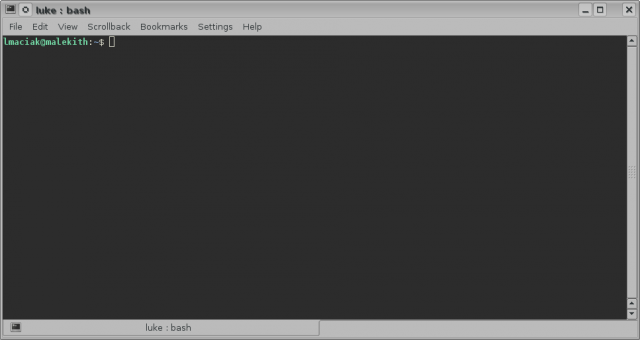
Personally, I think that command line is the most flexible and at the same time most intuitive user interface paradigm we have invented so far. There is a large number of people who would not agree with this statement. There is this this notion that command line is a thing of the past, and modern software must have a GUI whether it makes sense or not. Somehow a large number of computer users got it in their heads that this is absolutely terrifying, ugly, and outdated:
But it is not. This is a modern shell in a modern operating system. I took that screen shot on my Kubuntu machine which is actually quite newbie friendly. If you need to launch an application, you just type in the name. If the application is not installed, the shell will give you a helpful suggestion which package you should download to get it. If you make a typo, bash will usually pipe in with one or two suggestions for application names that are similar to what you typed. Working on the command line is quite similar to having a conversation with your computer. You type something in, and the machine either executes your command, or goes “I have no clue what you just said, did you by any chance mean XYZ?”.
I do understand where the fear and rejection comes from. Command line interfaces can be scary and intimidating at first. When you first start them, you are presented with a prompt and blinking cursor and not much else. To get started you have to look up and memorize a number of commands. You can’t easily intuit these just from the way the shell prompt looks. You need to learn the basics of the interface before you start working with it.
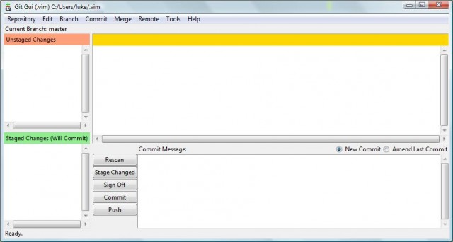
Graphical User Interfaces are designed to be “discoverable” – they expose buttons and controls to the user right away, and one is expected to intuit function from the design. The idea behind GUI is that you can sit a complete newbie in front of it, and they ought to be able to figure out how it works just by reading the button labels, and experimenting with the interface. Unfortunately it is not an easy task to design such an UI. Apple is pretty good at building these but they don’t get it right all the time either. Open Source projects are usually famous for notoriously bad UI choices. Unless you are purchasing software from a company that spent a lot of money or usability research and testing, chances are you will end up with a GUI that looks like this:
This is a Git front end tool for Windows. I have been using Git for a decent amount of time, and I consider myself fairly proficient with it, but I could not even begin to tell you how this tool works. It looks fairly simple – it has a few buttons, and panels, but how does it work? I don’t know. I can’t figure it out just by looking at it. There is a forest of deeply nested dialogs, panels and configuration screens hidden under the pull-down menus and the entire thing is gigantic, confusing mess. I feel like I need to read a manual just to figure out how to operate this thing. And I know git. I know what I want to do – I want to add files, commit and push. But this UI gets in my way. It doesn’t abstract the functionality as much as it hides it.
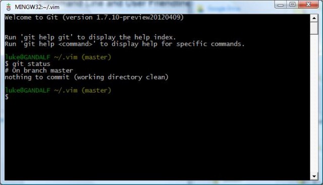
Compare it to Git Bash UI that ships in the same package as the one above:
Firstly, the interface is very clean. There is no clutter or complexity. I don’t have to deal with a dozen different Git features right of the bat. I get a command prompt that simply asks me “what do you want to do now?”. I type in “git status” to see what is the status of my repository – what files have changed since the last commit, what files were added, etc.. The shell immediately responds with a relevant message “there is nothing commit”. Clean, simple, intuitive.
I don’t know about you but I find the simplicity of the command line very zen and soothing. The GUI above baffles, confuses and intimidates me. The CLI is friendly and laid back friend I can converse with by typing in commands. I know there are better graphical front ends for Git out there, but I used this one as an example, because it is so bad. It is possible to design a good GUI but it is hard. CLI experience on the other hand is consistent – it is little more demanding at first, but you reap the rewards later.
I’m not the only one feeling this way. Richard Wareham conducted an interesting experiment back in 2001 in which he taught bunch of “computer illiterate” users to use Unix terminals without a GUI. You can read the article for yourself, but the results were interesting: his students who felt completely lost on their Windows home machines picked up bash very fast. Not only that – command line helped them to grasp concepts such as the hierarchical nature of the file system (something they did not understand before) and allowed them to customize their own environment. By the end of the class all the users were hacking their .profile files, making custom prompts, scheduling things with cron and etc.
CLI is much closer to the way we operate in real life – it is a conversational user interface. You “speak” to the computer and it responds back to you. It is the most intuitive, most natural and easiest to grasp type of UI we have invented so far.
To wit, we have been trying to re-create the CLI experience in GUI form for quite a few years now. Here is a prime example:
How is Google front page different from a shell prompt? It works around the same principles – you type something in, the machine parses it and things happen. And it’s not just search – Google has a lot of other functionality built into their site – calculator, currency checker, maps, etc.. Google UI is considered super user-friendly, while shell is scary. Why is that?
Or how do you explain popularity of such applications as Quicksilver or Launchy – which are essentially just very limited command line interfaces wrapped in flashy graphical overlays. Their function is the same as that of CLI – launch application when user types in the name. Most have plug-ins that allow other actions too. They masquerade as “search tools” or launchers, but what they really do is implement a small subset of CLI functionality while pretending to be GUI apps.
What is Apple’s Siri if not a voice activated shell? It does a lot of abstraction, yes, but the functionality is the same. People want to “talk” to their computer either via text of voice. Pushing buttons is a fairly decent interaction system – it works for quite a few things quite well. But it cannot be shoe-horned into every situation. At the end of the day, users crave the simplicity and intuitiveness of CLI.
GUI paradigm is missing that “speak or type to launch” feature. It cannot be abstracted by a menu or a dialog because these will actually add complexity rather than remove it. What is easier to use: a deeply nested menu with 500+ applications listed alphabetically, or a box in which you can type a name or function of an application, and the system will launch an appropriate one?
An average user wants CLI functionality but without the actual command line. They were told it is hard to use and scary so they will avoid it. But dress up the command line in a “search” interface or make it accept voice commands instead of written and they will be all over it.


Git’s probably a poor example of this because you really have to know how it works before you can start using it, GUI or no GUI. Actually, its GUIs are particularly poorly designed anyway so it’s probably an unfair example altogether. CLI find vs GUI find (plus grep or ack) would probably be a better example.
I think GUIs can be better for certain tasks *if* they’re well designed. They simply have more tools to provide feedback to the user. CLI’s have the ‘type and do’ paradigm down. The best GUIs have that too and I think the ideal would be a ‘type and do’ GUI, a la Gnome-Do. That’s what I understand the Gnome folks were going for with Gnome-Shell. I haven’t tried it (I want to) so I can’t say whether it worked.
Either way, I think the GUI vs CLI debate is the wrong one to have. The right one is how do we add the advantages of a CLI (composability, immediacy) with the advantages of a GUI (graphics, more flexible input/output paradigms). I have some ideas, but they all require Unix supporting more metadata.
I personally think the command line is rather friendly. Once your got your head around it its obviously much simpler and easier than the GUI for most tasks, as long as your shell and programs are standardized (and most are, really. Plus its hard to deviate.)
But then again it’s not “pretty looking”.
@ astine:
There are GUIs for grep and ack? I don’t even… :P
I think you are partially right – the GUI vs CLI argument is pointless. We seem to be on a convergence course from both sides. CLI has been very gradually improving the user experience for quite a while now. Compare the experience of using for example early MS DOS as opposed to modern Unix shell on a system like Ubuntu. On modern Linux systems the shell has smart prompts, typo detection, built in package manager hints and all kinds of other nice things enabled by default: auto-completion, colors, sane defaults on most programs, etc…
On the other hand we see GUI’s adopting powerful and smart search boxes and command processors that try to parse user input and figure out what to do. A kind of fuzzy logic / pattern matching approximation of shell.
One day these two trends may meet somewhere in the middle.
Every time I spend time digging through office menus trying to figure out how to change to landscape or change some printer settings I can’t help but bang my head against the wall at what a ridiculous excuse for UI all these dialogs are. I already know what I want to do. Enable color printing. Switch to landscape. I could just type that out. But no, I’m digging through menus and dialogs because someone decided that text was scary and buttons and windows were nice and friendly.
Even apps that can’t completely be replaced by a command line application (like maybe an office suite) can greatly improve their functionality and usability by offering text-based interfaces to their menu systems, sort of like what Ubuntu’s trying to do with their new dash in 12.04.
What I think would be interesting would be some strongly-coupled CLI-GUI interactions. For instance, let’s take Word as a start. What if you could swap to your CLI and say “load letter template” and it would walk over to Word and do that for you in the GUI? Or in Excel, instead of clicking through the charting wizard, instead have a CLI that lets you configure the options at will?
I think that would be the next greatest thing in non-mobile UI design.
Come on, you explain perfectly why Google and Siri aren’t just a shell – they solve the discoverability problem by accepting very fuzzy input and giving you what you want – they solved the problem of understanding user intent very well, unlike the shell.
I think you’ve identified the difference between workflows that are command driven (which, surprise, a CLI is great for) and workflows that are exploratory or can be reduced to a few options.
The command line is a very precise tool that’s great for specifying the exact command to be run with the right options and flags. Most command line tools are written by programmers for programmers, and it shows; check out the man pages for ls for all its glorious settings. Imagine a Google maps as a command line tool, though, and all the options become overkill and the precision is less important.
I’ll even throw in an example about git. Github has a feature on its pull requests to automatically merge the branch if there are no merge conflicts, and on the webpage it has a “big green button” that does that one simple, well-defined action. Their corporate product, Github Enterprise, is behind the public site by a few months, so we didn’t get that button for a few months, necessitating opening a console and repeating the same few commands whenever someone wanted to approve a PR. That button – such a simple, convenient piece of GUI – was one of the most requested features and a big motivation for us to spend the time & effort to upgrade.
I do use Alfred on my Mac and I have no problem with that. BECAUSE. It does not feel punishing. I use Terminal when I absolutely have to, but I’m always stressed about it. Even the simplest CD command – in Terminal window I become extremely prone to typos. And it’s not as easy to spot them and fix them as in any other window. Maybe it’s just my perception. But I absolutely HATE typing paths to anything. That’s what I like about GUI in OS – I don’t have to remember the exact path, I can just click around.
@ Victoria:
Are you aware of tab completion?
There are also other tools that can help in certain, specific cases. Like fuzzy file-finders for things like vim.
@ Alec Benzer:
Nope, I wasn’t aware of that. Thanks. Each time I need to do smth via Terminal I promise myself to get better acquainted with it, but it never works :)
Vim terrifies me absolutely. I had to install it since I had to do search/replace on a database dump file ~50M in size and every other text editor just died on me. But when I see the actual Vim window, my brain shrieks in agony :)
While there are many things I don’t like about Autodesk, the user interface for AutoCAD has always been one of the better examples, I think, of how a program can be set up. Even the 2013 version has improvements for the command line, and you can use all sorts of input methods from it cli to toolbars to pull-down menus to… gasp, even a ribbon. I would hazard a guess that the flexibility to use whichever method you prefer, or any mix, is no small part of how it become so ubiquitous.
@ StDoodle:
Offering multiple ways to do the same thing has nothing to do with usability.
“As a user researcher with a primarily qualitative background, I have to confess that when I was asked to conduct a usability benchmark study on AutoCAD, I was not exactly jumping out of my chair.”
Source: http://dux.typepad.com/dux/2009/09/a-case-study-in-largeapplication-us ability-benchmarking.html
@ MrJones2015:
Just found this, definitely worth reading
http://www.evanyares.com/cad-usability-sucks-part-3-its-not-cad-its-yo u/
@ Alec Benzer & @ Michael Chui:
This is a very, very good point. A small “command” box along with a key binding would make working with a lot of these “office” applications so much easier. It would also make writing manuals an instructions easier (type this in, vs go here, find a button that looks like this, flip the toggle, check the box, etc..).
Seriously, someone should fork Open Office and create a command box that would let you do stuff like:
– document lanscape
– page current columns=2
Etc..
@ Roee:
Yes, but at the cost of flexibility. In the shell you can pipe I/O between apps, use wild cards, and etc… In GUI, not so much. Also, “search type GUI” is still relatively uncommon. Traditional GUI with a million buttons and hidden panels is still the “default” – mostly because it is easy to put together, whereas good search-box that does not suck takes effort and finesse.
@ Allen:
Very good points. Though I would argue that the Github thing is not really a GUI vs. CLI example, but a workflow example. Or rather an example where work does not “flow” so to say by enforcing a context switch.
Usually when you get a pull request you see it in your mail, or as a notification when you log into the site. At that point you are in your browser and you have your hand on the mouse. It is only logical to have a button there that would perform a common action – you stay in the browser and all is well. The alternative, as you say is to open a terminal, navigate to your project and type in a command which breaks the flow and forces you to switch context. Then you have to go back to the browser to continue reviewing other stuff.
@ Victoria:
Mac terminal has tab completion to aid you in typing long paths. You can type in a few letters of the folder and hit tab to expand it. I don’t think the bash version on mac does this but a lot of Linux systems are configured to try to guess what command you are typing and tab-expand it for you too, or provide suggestions when you make a typo.
Oh, and here is something to fuel your nightmares.
In all seriousness though, I’m glad to hear my favorite text editor conquered a crazy database file when all other failed. Old school design from the age when bandwidth was measured in baud wins again. :)
@ StDoodle:
Never actually used AutoCAD but yeah – that sort of design is a good idea. Your comment reminded me of GNUPlot which is basically a visualization/graphing tool with a command line interface. Most people balk at this at first, but then you realize “oh, shit – I can script this thing and make my graph the same exact way every time”. :)
I love the power unix command line gives me. When I start my computer after 15 seconds text based login screen shows up. I log in and my system trows me in busybox ash. I love it and I only really start X when I use QEMU to test my OS. I have around twenty shell scripts in my ~/bin along with my toybox utilities. Everything is fast and lightweight. I can just type
ed somefileand it starts under a second. Also the power of posix compliant shell is amazing. I have written package manager, text editor and gopher browser in shell scripts. I still have to say that it is not very luser friendly. It is powerfull and easy to write programs to but takes some learning.PS: Posting from my phone because acute lack of javascript enabled browsers that run on sane speeds on my computer (700MHz Pentium III, 64MB of RAM, 30GB HD)
Welcome to the gadfly table!
I added your link to the bottom under updates.
MrJones2015 wrote:
I would disagree; the SUM-explaining site linked in the article you refer to mentions three main aspects to usability: “… completion rates and errors (effectiveness), task-times (efficiency) and task-level satisfaction (satisfaction).”
Being able to do user-input in the way that works best for me seems helpful for all three.
Now, I’ll grant a few things. First, I know that’s not the be-all / end-all to usability, but I do feel it contributes. Second, there are likely some technical definitions to the “usability testing” world that further limit the aspect of the “multiple input” path, but all I can say is I’ve used several CAD programs (and done hand-drafting), and I feel that at least for me and other CAD-monkeys I’ve discussed this with, being able to customize your UI has at least felt like it made it easier to do our jobs, and made them seem less arduous.
@ Victoria:
Try TextWrangler; that’s what I used before I learned Vim, and it is a wonderful text editor with a good GUI and a good command-line interface, which is capable of editing big files and doing search and replace very well.
Taking a poorly designed GUI (the one shipped with msysgit) as an example does not win any argument. You could find a command line tool with no man and no –help, and you would end up doing even less than with the aforementioned GUI.
It takes more work and skill to come up with a good GUI than to come up with a usable CLI, but if done in a smart way, the GUI can trash the CLI in productivity and training requirements. So one could make the case that a CLI is only useful for when there is no good GUI (and for scripting, of course).
Now if I had to come up with an example, I could stay in the DVCS world, and start arguing about how it’s more convenient to work with TortoiseHg Workbench than with the already quite good Mercurial CLI…
It’s not expecting proper syntax and arguments, and there is a button with the text “search” on it, so it gives you an idea of what it does.
By taking a common denominator (at the very least, the laws of physics), you can find that anything works around similar principles as anything else, but it doesn’t make them equal as even what appears to be details can make a huge difference. Our DNA differs only by less than 2% with a chimp’s DNA, but we can build skyscrapers and walk on the moon.
A simple answer would be because it tries to fit the user, and not have the user fit it. In other words, people really just want to search, so Google tries to make results more relevant and starts interpreting the input.
Somebody with bad spelling wanting to convert euros to dollars will type “convirt cetimenters in inces” and the result page will show a unit converter.