Let’s say you have written a programming library or a framework and you want to put it online for all to see. Chances are you are not a web developer or a designer and perhaps you don’t have much expertise in designing great looking and usable websites. You might be intimidated by this task. After all, a badly designed website may actually discourage people from using your products. How do you make sure you don’t scare away or discourage potential new users? Well, you must remember a golden rule of web design for libraries, frameworks and tools:
Never show the code samples right away!
It is a rookie mistake most often seen in the open source projects. You visit their website and bam, there’s a neat little box of code right in your face. It is rude, offensive, impolite and inconsiderate. Programmers are inquisitive beasts and they don’t want code to be given to them on a platter. They want to work for it, and it is your job to make that search interesting for them.
Let me use an example here: Rails is undeniably one of the most popular web design frameworks out there. It is well funded and it has a huge community. This is not necessarily due to the design of their website, but I’m sure that it helps them to maintain that lead. Just look at this masterful layout:
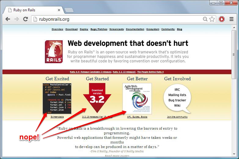
Rails Website
I mentioned that programmers like to be teased and tantalized with promises of code samples, and this site pulls that off masterfully. The big links on the front page titled “Get Excited” and “Get Started” seem to imply that they may lead to some actual code examples. The first one even has a nicely highlighted screen-shot of some code. But clicking on them takes you nowhere near actual documentation. That’s what the tiny link on the top of the page is for. And even that one doesn’t really take you to actual code as you need to scroll and click through installation instructions for all the different platforms first.
Here is a perfect example of how not to design websites: witness the Sinatra framework and it’s terrible, terrible front page.
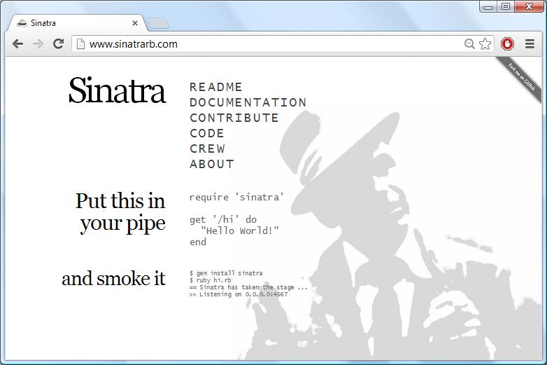
Sinatra Website
I picked Sinatra, because like Rails it is a Ruby based, rapid web design framework. But unlike Rails which has an adorably complex, labyrinthine website, Sinatra gives up all the interesting stuff on their front page. Not only can a user see a code sample for a fully functional site, but there are also installation instructions for the framework right below.
Front page of a framework or a library website should be a place where you post community news updates, information about events, links to the websites of your partners and etc. That’s the important stuff. Sinatra team on the other hand decided to put nothing but code on their front page. With a site like that, no wonder their framework is so much less popular than Rails.
But not only big frameworks sport amazingly designed sites. Sometimes little guys produce things that are equally amazing. Here is the front page of the GeSHi code highlighting library for PHP:

GeSHi Website
Where do you go to learn how to use this library? I don’t actually know. None of the links on the side-bar lead to any usable documentation suitable for beginners. A complete newbie will probably spend close to 20 minutes wandering around of the website looking for working samples – and that’s exactly what you want. User retention! It looks great in your Google Analytics profile.
Note the clever use of misdirection: someone new to the site might try to click the two “code snippet” looking areas on the site thinking they lead to examples. Nope, those are screenshots of code that was highlighted by GeSHi! The actual instructions of how to produce such results however are buried deep in the documentation.
For comparison, please look at the website of the excellent PHP ORM known as RedBean. Similarly to GeSHi it is a small, open source, community driven project that doesn’t have the backing of say Rails. Like GeSHi they should have created a labyrinthine, unhelpful website to attract programmers. And yet, look at this atrocity:
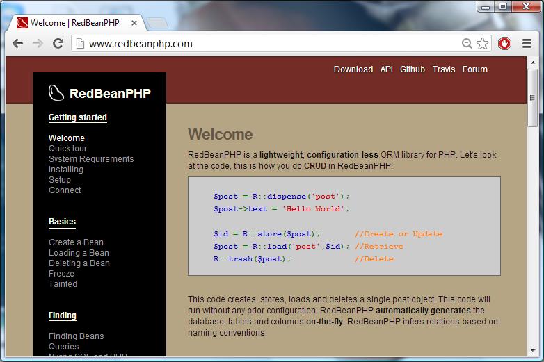
RedBean Website
Almost all you need to know to actually use the library is right there, on the front page. You can see it almost as soon as your browser is finished loading the page. What is this? Why on earth would anyone want that?
My all time favorite example of an excellent site design was the old Jekyll website. It was an absolute masterpiece:
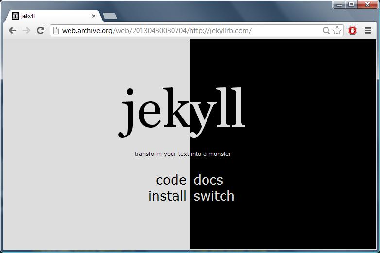
Old Jekyll Website
Just take a few minutes to take it all in. Note the simplicity of design and the spartan layout. There is almost an air of mystery about this site as it tells you absolutely nothing about what the project is or why you would want to use it. There is some random line there about transforming your text into a “monster” but it doesn’t actually give anything away. It is tantalizing, mysterious and quite intriguing. Someone stumbling upon it by accident would have absolutely no idea what to make of it.
Compare it to the recent redesign:
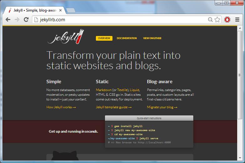
Current Jekyll Website
The moody, mysterious text about monsters is gone, replaced by actual description of what the software actually does. The spartan, black and white design was dropped in favor of a responsive grid driven piece of crap. Worst of all, now there is a box on the bottom of the page that shows you how to install the tool and set up a new website. Back in the day actually figuring out how to boot-strap Jekyll website was a right of passage that ensured only the most determined programmers used the platform. Now it seems accessible to just about anyone.
So remember kids: never put code samples on the front page. Bury them deep in the documentation so that busy programmers must take time to find them. Without work and effort they will never appreciate the brilliance of your tool. Make your website vague and unfriendly. Fill it with community news updates, pictures of events and success stories of your partners. Make sure that the front page doesn’t actually describe what your project is all about. People visiting your site should already know what it is all about. Hell, I’d recommend avoiding describing your project in layman terms anywhere on your website. The more aloof and non-descriptive you get the better.
Disclaimer: in case you haven’t figured it out, this was intended to be satirical.
That was awesome….your toungue was so firmly planted in your cheek that I almost fell for it :-) Nice work!
Scott
Disclaimer: Of course it was clear from the very beginning. That’s why I got a bit confused meeting an accidental confession “I picked Sinatra, because like Rails it is a Ruby based, rapid web design framework. But unlike Rails which has an adorably complex, labyrinthine website, Sinatra gives up all the interesting stuff on their front page.”
Your readers are not too dull to be in extreme need of spoilers :-)
This is not an article you want to skim read with very little sleep been had.
At first I thought you were serious. In my head I was thinking, “What? An example is worth a thousand words!” I’d take poorly-written documentation with lots of examples over well-written, example-less documentation any day.
Good writeup!