I have a nice little binary clock from ThinkGeek standing on my desk. It is a silly gadget, but as any geek I lust for this sort of things. Awesome little toys which remain incomprehensible and mysterious to mere mortals. It is sort of a symbol – normal people look at the damn thing dumbfounded. Fellow geeks, smile with approval when they see it – they know they found a kindred soul. Then there are those people who don’t actually believe that this toy shows time, or that you can reliably read it – so they challenge you.
Tell me what time does it say it is, right now! Quick!
The problem with these clocks is that unless you are standing next to it, in a well lit room they are incredibly hard to read. Reading one from across the room – especially when it’s dark, and the unlit lights cannot be seen, is not easy. For example, imagine you wake up in the middle of the night in a dark room and you glance on your binary clock. What time is it?
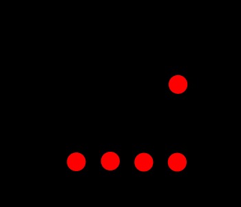
At the first glance I would say it’s either 11:15 or 11:19 depending on whether the highest dot is in the 4 or 9 position. It is hard to tell without any frame of reference. And that is the point here. All we see are dots suspended in black void. If you would approach the clock and look more carefully, you would see a different picture:
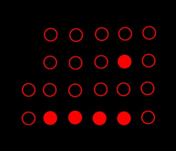
Oops. It’s actually 1:11 and 50 seconds. Because you had no frame of reference and you didn’t see the “zero” columns the whole image shifted slightly in your mind. Of course if you wait a second or two you will notice the last row changes way to quickly to be considered “minutes” and another row will appear as the seconds pass. This will let you guess it is actually 1 instead of 11. Similarly, you can distinguish a 4 from an 8 by observing the seconds column and comparing relative distances. But it is in no way intuitive, or quick. Unfortunately this is the design of every single binary clock gadget I have seen on the market.
The problem is that the unlit LED’s are as important as the lit ones when you try to read this sort of a time piece. A slight change in design to actually illuminate the LED’s in OFF position would make these devices much more readable. How do you illuminate them in a way that would make sense? You can do it in the way I shown on the picture – simply show an outline, or a filled dot. This could be done using some sort of a shutter or a film to cover the OFF LED’s and fully expose the ON ones. Alternatively you could use different colors or intensities. For example you could use a contrasting scheme with dim red lights for OFF and bright green/blue LED’s for ON.
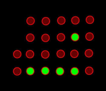
How does that look? How would it look on the other end of a dark room? Personally I think such design would be much more functional. A binary clock we could actually read from far away, and in poor light conditions. Imagine that! What do you think? Are you happy with the current design? What is your suggestion to make these things easier to read while retaining the charm and geek factor of a binary clock?
[tags]clock, binary clock, think geek, timepiece, binary[/tags]
I keep thinking about getting a binary clock, but perhaps I’ll wait to find one of your design. :)
Ether I can’t read binary clocks either or you can’t, because it looks like that clock is reading 1:11 and 50 seconds, not 40…
Yes, you are right. It is 50 seconds and not 40. Good catch!
I was just checking if you guys are paying attention. ;)
I never thought I’d hear the words “binary clock” and “functional” in the same sentence… well, without the “not” of course :)
colour combinations reminds me of having my eyes tested. Perhaps issues with red/green colour blindness. Would suggest a range of blue/red and blue/yellow combinations. Would be great to see these at trainstations and airports. LOL
@Paul: Heh, I didn’t think about that. But yeah, any color combination would be fine. You could also use dim red and bright red as long as there is enough difference between them to be able to tell the dots apart in a dark room. :)