If you read my last post from few months ago, you probably know I’ve been quite broken up by the demise of my favorite miniature game. Fear not though, I’m ok now. I have fallen in love with another tabletop game. The death of Warhammer ended up being a good thing, because it shook up the local gaming scene, and allowed me to branch out and try new games. New, vastly more affordable games, with tight rules and supported by companies that care about their customers. Right now, for example, I’m really into Warmachine which is absolutely fantastic. I probably would have never gotten into if it wasn’t for the hilarious failure of Age of Sigmar, so thank you Games Workshop for opening up my eyes.
Getting into a new game, which has a vibrant community and great organized play support feels great. Last time I was this excited about tabletop wargaming was my freshman year in high school when I first discovered the hobby. Only now I’m a grown-ass adult with disposable income that I can irresponsibly piss off on plastic army-mans (an on a completely unrelated note, could you guys please click on the ads a lot this month, please?).
I figured I might as well put together a list of useful Warmachine (and general wargaming hobby) things for future reference. This is probably more for myself, so that I don’t forget where to find these things, but perhaps some of you will also find it useful.
Printable Warmachine Resources
Steamroller is the official Warmahordes tournament standard which provides rules and regulations specifically designed for tournament play. While all these rules are optional, they provide a set of 8 game scenarios which are incredibly well thought out and balanced. For example, Privateer Press noticed that in high level tournament play getting the first turn gave players significant advantage, which is why Steamroller scenarios use asymmetrical deployment zones to even the playing field.
PP updates the rules every year. Here are the links to the recent sets:
The 2015 Steamroller Scenario rules are also available as a neat set of printable cards:

Steamroller Scenario Cards
Each scenario comes with a two sided card, and there are extra, single sided cards for Steamroller objectives on the back page.
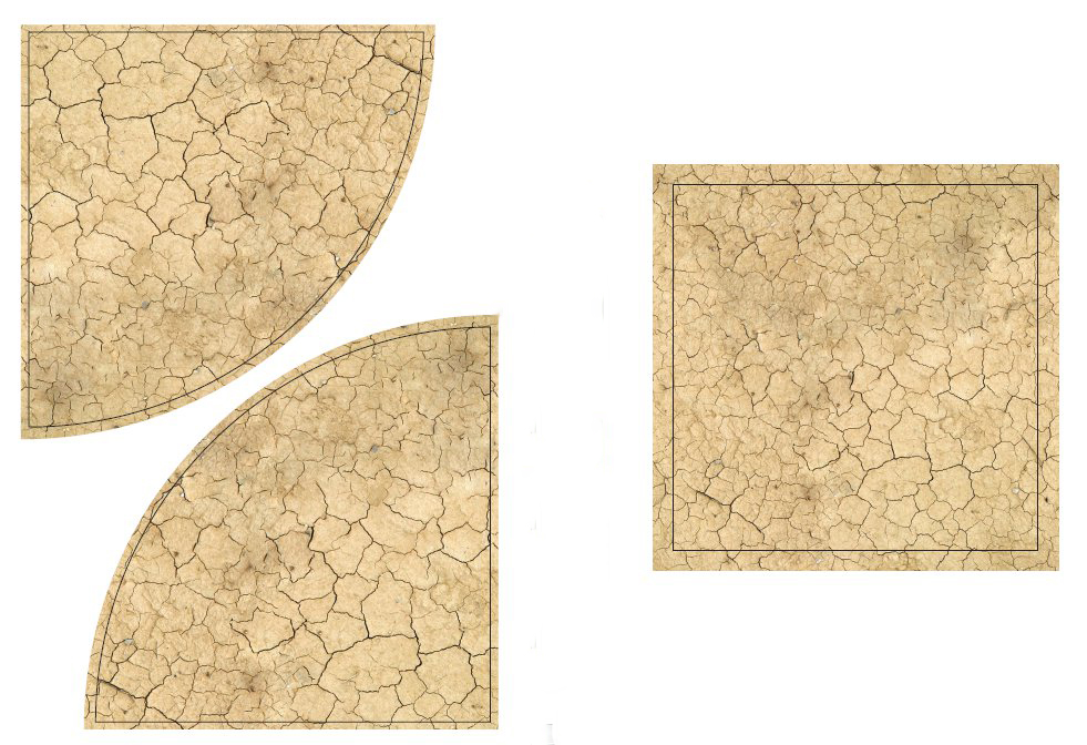
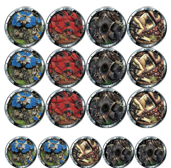
Steamroller also uses concept of scoring zones that need to be clearly marked on the table. People use all kinds of different markers, but I’m kinda fond of these printable templates by Warmachine Masters.

Zone Templates
In case they ever decide to take them down, here is a mirror:
I’m not entirely sure who make these fantastic Wreck Markers but I really love them. Print them out on a thicker paper, or glue them to a piece of cardboard and you are all set:
Printable Wreck Markers
These are split into two files by factions:
Sorry Convergence players. No markers for you.
Finally, here are the official printable Warmachine templates:
These will work in a pinch, but you are definitely better off with the plastic set.
Markers and Templates
The official set of Warmachine tools and templates is fantastic:
As much as I love the large 5″ precise movement tool in the Quick Measuring Set. That’s the one that has X edges: one marked 5″ for checking Stealth range, one marked 3″ for checking LoS in the woods, one marked 2″ for Reach and one marked ½” for melee range. It is extremely useful, except for measuring movement distance when you play an army with basic MOV6.
I highly recommend picking up this one as well:
The long edge on this tool is 6″ which allows you to use it for movement without actually having to bust out your measurement tape. The remaining edges are 4″, 2″ and 1″ respectively. Between these two tools you should have all the short range measurements covered.
We’re currently also using these Warsen.al Acrylic Flag Templates for Steamroller scenarios:

Warsenal Flag Markers
They are mounted on 40mm bases which, apparently works both for Infinity and Warmachine. The flags are fantastic, and they really stand out on the battlefield. I highly recommend the orange tinted ones especially – they look striking on green felt table.
Sometimes you need some proxy bases, either for proxying a unit, or as an objective marker (if you don’t feel like modeling one). Here are a few good sources:
All of the above offer standard Warmachine/Infinity/Malifaux base sizes of 30mm, 40mm and 50mm. The Warsen.al bases are flat, transparent fluorescent proxies. The Wyrd bases are fully functional and can be used to base your models.
Papercraft Terrain
I’m not very good at making terrain. Recently however I discovered that it is entirely possible to set up a decent looking table with zero skill and limited resources using papercraft terrain. It is a perfect solution for wargamers with limited time and limited budget. Paper buildings, walls and streets are cheep, easy to assemble and look perfectly presentable on the battlefield. For example, for our recent Warmachine game we have assembled this small town square:
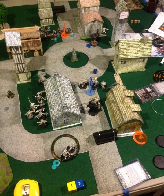
Papercraft Terrain
Roughly, 90% of what you see there was made out of paper. My favorite resource for papercraft buildings is probably Dave’s Games:
The site offers a few free buildings, but the better ones cost actual money, albeit not much. I purchased several, with no regrets. Most ship as layered PDF files, which allow you to pick and choose from a wide variety of wall textures and ornaments.
If you don’t have cash to throw around, Wizards of the Coast have a small collection of fantastic papercraft buildings for D&D here:
In the picture above we used the FPM Roads files to create the cobblestone streets.
Here is some more flat terrain you may want:
Game Tools
One of the best purchases I have made this year was this particular tool:
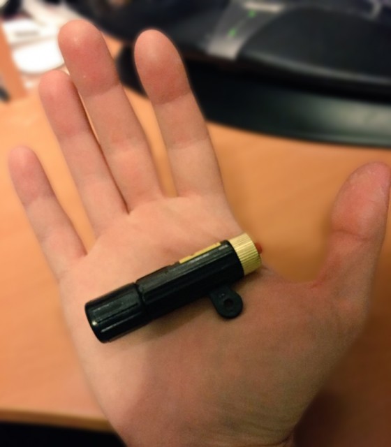
LoS Tool
It is a laser pointer that projects a line onto the table. It is perfect for checking line of sight in a game such as Warmachine where you are not allowed to pre-measure distances and so can’t use measuring tape to check shot angles. I have seen similar tools marketed directly to wargamers sold for over $50, but I bought mine at a hardware store for less than $5:
As for measuring tape, I’m still using a good old Stanley Powerlock 33-210:
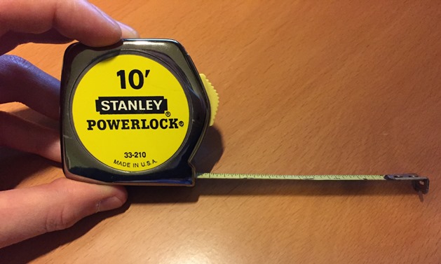
Stanley 33-210
I actually bought it in 1995 to play Warhammer Fantasy, and have been using it ever since. The tape is showing signs of rust in places, but overall it continues working quite well. The damn thing is nearly indestructible.
I’m very fond of Jumbo Dice like these:
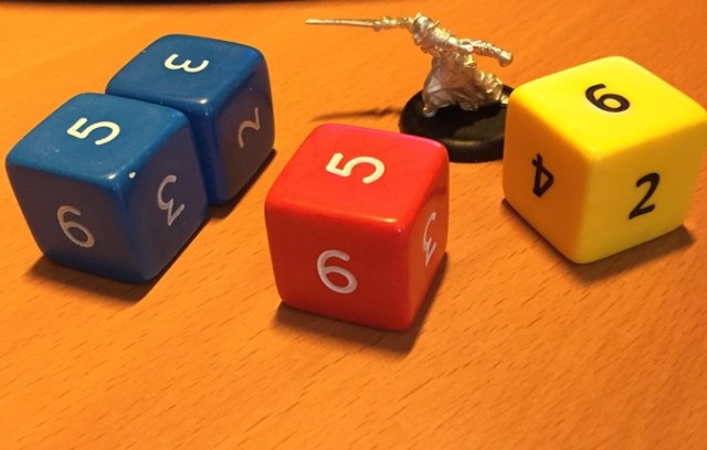
Jumbo Dice
No, not for regular rolling during the game. I usually set three of these on the side of the table and use them for tracking the turn number, and victory points scored by each player.
Warmachine is a very dice efficient game. You will only ever need five or six dice, so I it is actually a good idea to invest in a nice, good looking set. A lot of players use the officially licensed Warmachine dice sets, but the readability on those vary depending on the faction. Cygnar dice set for example is pretty decent, but the Retribution set is awful. If you are standing across the table from someone using these, you literally can’t see what they rolled.
Currently I’m using a set of Chessex Frosted Dice (5 clear and one smoke for damage allocation) to go with my Retribution army. That said, I’ve been thinking of upgrading to a fancier set like one of these:
Getting a set of six would cost $30-40 which is incredibly expensive for dice, but the coolness factor of rolling metal or stone dice may possibly make it a worth while investment. That said, metal dice are pretty heavy and may rip up felt mats and chip paint of terrain pieces if rolled too hard.
The other thing every Warmachine player needs are card sleeves. Unless of course you don’t mind getting your cards getting damaged, and having to replace them every once in a while. At the moment I use these hard top loaders:
They are slightly over-sized, but Warmachine cards are thick enough to fit snugly and stay in place. If you buy these for Malifaux you will need clear sleeves, because their cards are much thinner and much sleeker which makes them slide out of these. The hard top-loaders provide great protection and the surface is perfect for writing on them with dry-erase markers.
Online Resources
One of my (many) favorite things about Warmachine is that Privateer Press provides their own army building tool called War Room. The basic tool is free, but you do have to buy card sets for the factions you play. The sets are priced reasonably, and they get updated automatically whenever PP publishes an errata, or adds new units via expansion. It also gives you damage tracking functionality, so you don’t even have to bring your cards to the game (and if you do bring them, you don’t have to draw on them).
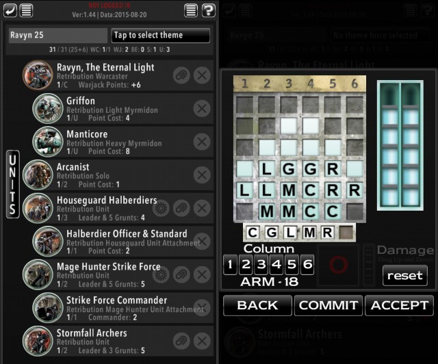
Army Building Tools
At first I was a bit skeptical of the mobile only nature of this tool, but after using it for a while, I can’t imagine living without it. Especially since it lets me list-craft anywhere, at any time as long as I can get to my phone.
For those who prefer more traditional approach, there is always Forward Kommander:
It is a third party tool and it allows for basic list building. It will also print out nice damage grids on paper. Unfortunately it is hampered by the fact that it’s someone’s hobby project, and so you often have to wait a while for new units to be added after an expansion comes out.
Hobby Tools
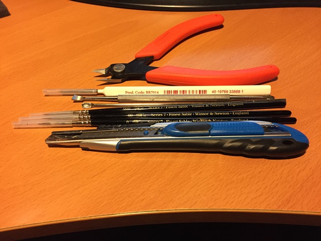
Finally, last but not least here are some of the tools I use to assemble and paint my miniatures. Despite being a long time Warhammer player, I never really liked their hobby tools. Their brushes are garbage, and their tools are way to expensive for what they do.

Hobby Tools
The most useful tool I have bought recently is the Xuron Spure Cutter. This tool does not necessarily get that much work done when working with Warmachine minis (which are metal, or resin that’s cut off the spure prior to packaging) but it is absolutely essential if you play stuff like Malifaux.
The difference between this tool, and your average hardware store set of pliers is that it is almost entirely flat rather than angled allowing for precise cuts where it matters.
The tool that does see a lot of use with Warmachine minis is a seam scraper:
I find that it offers better control than an exacto knife blade, and removes the risk of cutting in too deeply, or chopping off some important detail if your hand slips.
When it comes to brushes, lately I’ve been using Windsor & Newton Series 7 among other things. Here are some brushes I recommend if you need some new tools:
What are your favorite brushes and tools? Do you play Warmachine or any other war game right now? Care to share any resources? Let me know in the comments.