Ever wanted to create in-cell bar chars to help you visualize some large data set? A picture is worth a thousand words, so I will just show you what I am talking about and how to do it:

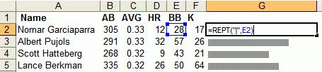
image © juiceanalytics
I never really thought that you could use the REPT formula in order to do this. But this is ingenious! Juice Analytics explains this in detail, and also provides some tips on how to create even fancier, and complicated in-cell charts.
This entry was posted
on Friday, August 4th, 2006 at 1:09 am and is filed under technology.
You can follow any responses to this entry through the RSS 2.0 feed.
You can leave a response, or trackback from your own site.
Related Posts:
Excel: Too many different cell formatsParsing Excel Files with PerlDump MySQL table into CSV fileExcel: Adding Checkboxes the Easy WayWhat kind of applications do you have open right now?Read Excel with PHPYou know you are working at a small company if…Convert a large Access table into Excel filesGmail open to public? Google collecting cell phone numbers!MS Office Addiction
August 4th, 2006 at 12:16 pm (478) [Quote]
Suh-weet!
Posted usingAugust 5th, 2006 at 2:04 am (479) [Quote]
Yeah, and I usually avoid MS office like a plague. But this thing is neat.
Posted using